11 / The Studio · Material
VISUAL LANGUAGE
How visual choices work together to communicate
You’ve already explored many of the choices that shape an image. Here, notice what begins to happen when those choices come together.
What changes when you treat the same subject differently?
TODAY’S FOCUS
What are your choices doing together?
Look
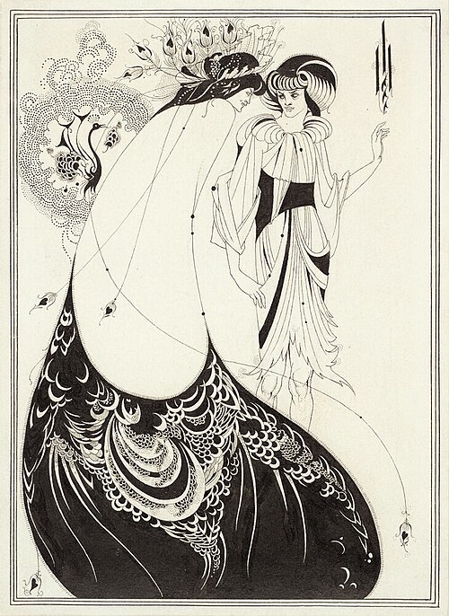
Look first. Where does your eye go?
- What do you notice about line, pattern, the black and white shapes, and the empty space?
- How do these choices work together to give the image its character?
Understand
HOW CHOICES WORK TOGETHER
LINE · SHAPE · TONE · COLOUR · SCALE · PLACEMENT · MARK · SPACE
Look at how these choices meet. Which ones are doing the most work? What changes when one of them shifts?
EMPHASIS
One part receives more attention than everything around it.
CONTRAST
Difference makes a choice visible.
REPETITION
A choice repeated across a work starts to feel deliberate.
UNITY
Choices that belong together can make a work feel connected.
HIERARCHY
Choices can guide what is seen first, next and later.
These are not rules or a checklist. They are ways to describe what visual choices are doing together.
Test
TRY 01 · CHANGE ONE CHOICE
Draw the same small, simple subject twice, at the same size.
In the second version, change only one thing. A heavier line. A darker tone. More space around it. A different mark.
Keep everything else as similar as you can.
Place the two versions side by side.
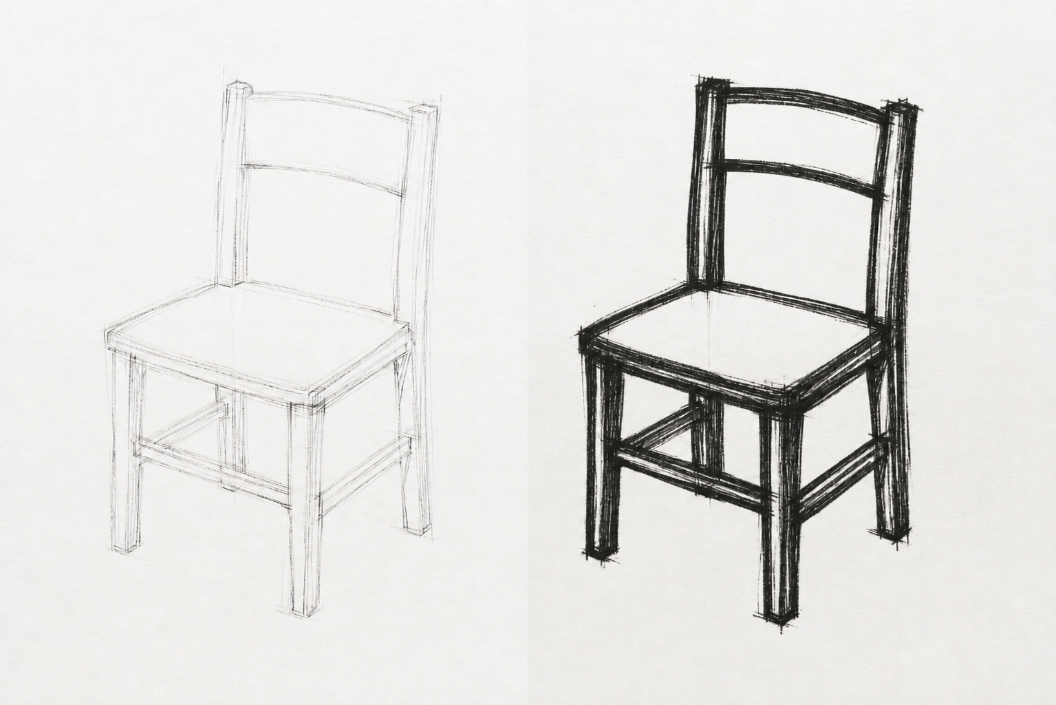
CHAIR STUDIES / LINE WEIGHT
Studio exercise.
What changed?
Which change affected the work most?
Make
ONE SUBJECT · THREE VERSIONS
Choose one simple subject. Make three versions.
Keep the subject the same while changing the visual choices. You might change line, tone, colour, scale, placement, mark, space or material.
Before each version, decide what you want the visual language to do. You might begin with an intention such as quiet, urgent, uncertain, or choose your own. Then make choices that respond to that intention.
Use drawing, ink, print, collage, paint or another material that suits the version you are developing. Notice what the material changes as you work.
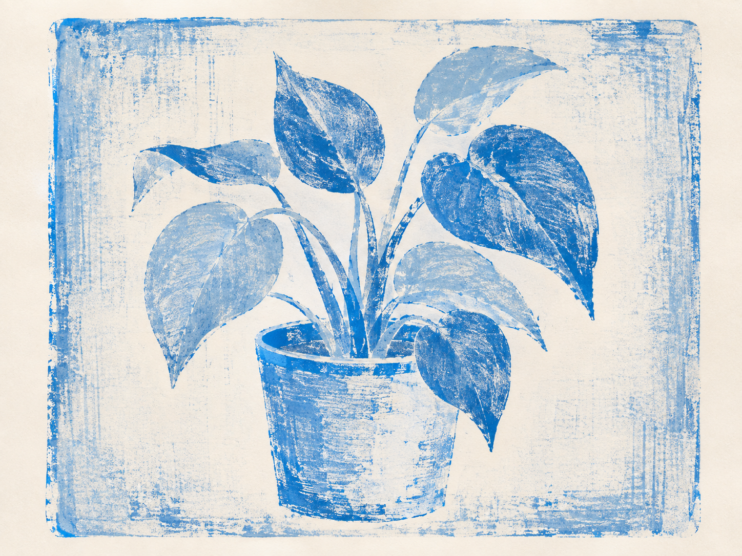
MONOPRINT PLANT
Visual material: Studio work, 2026.
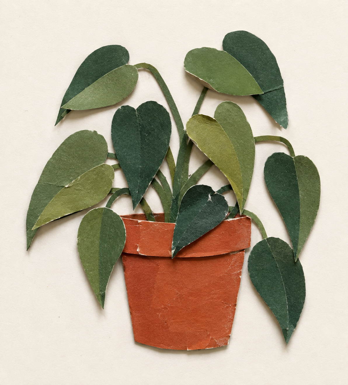
PAPER CUT PLANT
Visual material: Studio work, 2026.
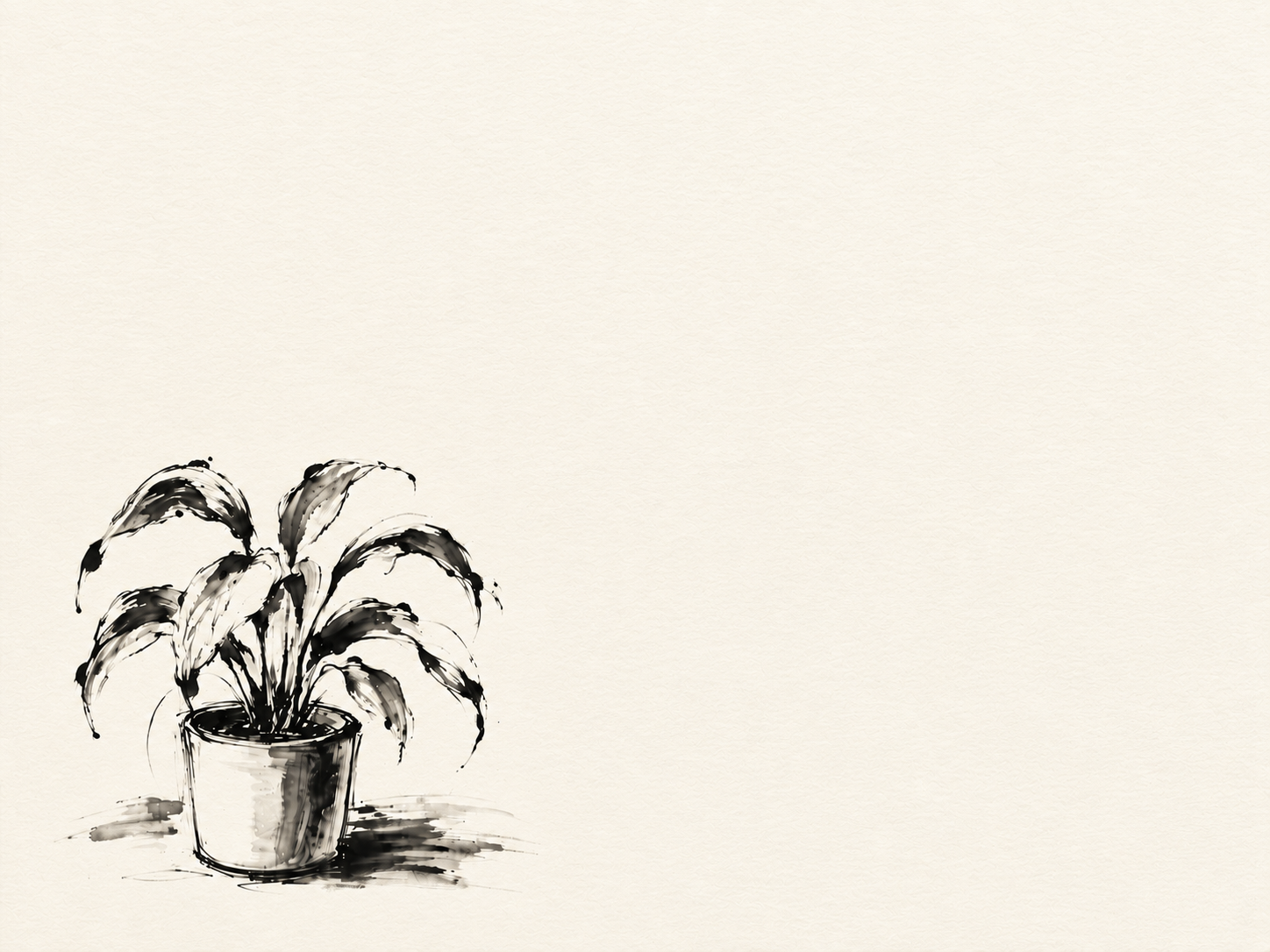
PLANT STUDY / INK + SPACE
Visual material: Studio work, 2026.
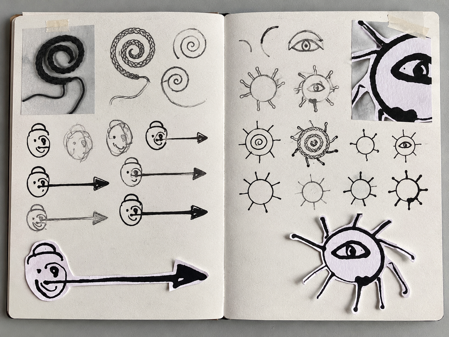
DIFFERENT SOURCES CAN BECOME RELATED MARKS / THROUGH REPETITION, VARIATION AND COMBINATION THEY BEGIN TO FORM A VISUAL LANGUAGE
Visual material: Studio work, 2026.
Look again
Show the three versions to someone without explaining them first. Ask what they notice and what each version seems to communicate.
Where their reading connects with your intention, look for the choices that carried it. Where it differs, look again.
Which choice might you change?
DID IT SAY WHAT YOU MEANT?
In practice
Artists and designers build visual language through the choices they make and develop over time.
Those choices might respond to an idea, a material, an audience, a place, a purpose or something discovered through making.
Some visual languages become recognisable across a body of work. Others are developed for a particular context or communication.
What seems to be guiding the choices here?
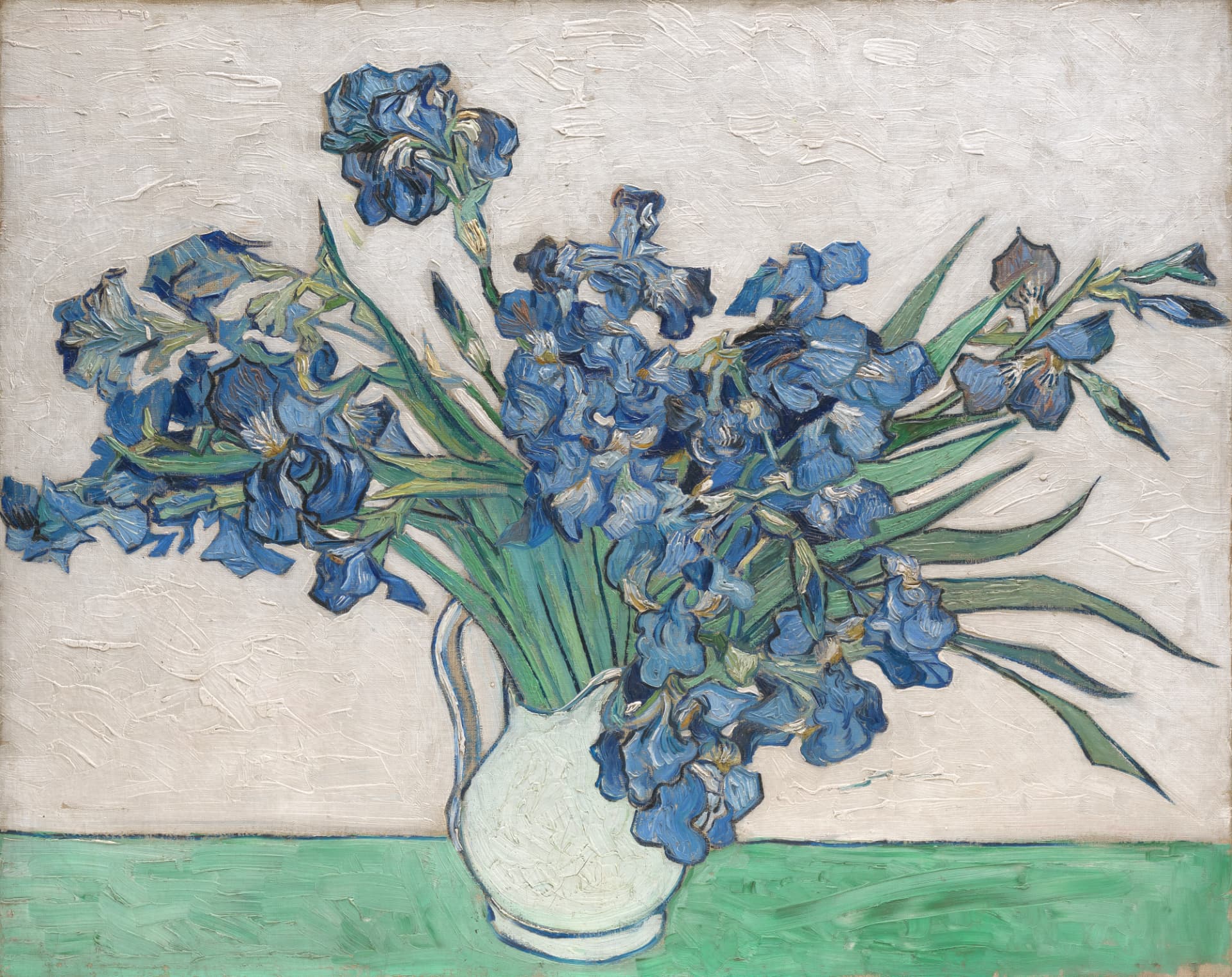
Look at how colour, brushwork, contour and composition work together. What do these choices begin to make you notice?
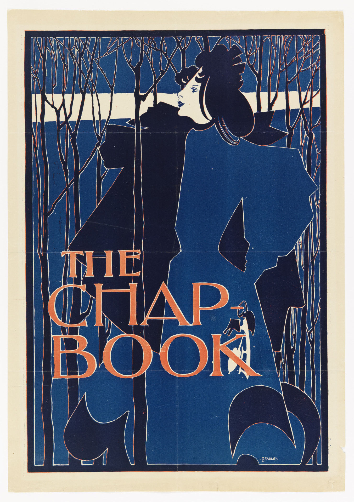
Look at the restricted colour, flat shapes, silhouette, negative space and typography. How do these choices work together to communicate?
In your practice
KEEP THE VERSIONS
Keep all three versions, not only the one that worked. Place them side by side so the differences remain visible.
Record which choices changed, and what changed because of them. That record is something you can return to as your own visual language develops.
Creative thinking
Which visual choice is doing the most communicating?
Between your versions, which change shifted the work most?
Record what you changed and what changed because of it.
What visual language are you beginning to develop, and what can it communicate?
Which combination of choices worked best, and what would you refine next?
Does the hierarchy suit the purpose and audience? What should be read first?
Tools to help you notice, describe, question, develop and document your work.
Source note
Developed through studio practice, curriculum guidance and established art and design theory. All instructional material on this page is original.
Curriculum + reading
Bowden, M., & Tooke, A. (2022). Art making and exhibiting: VCE units 1–4. Cambridge University Press & Assessment.
Greenwood, D. (2023). Art creative practice: VCE units 1–4. Cambridge University Press & Assessment.
Victorian Curriculum and Assessment Authority. (2022). VCE Art Creative Practice study design 2023–2027. vcaa.vic.edu.au ↗
Victorian Curriculum and Assessment Authority. (2022). VCE Art Making and Exhibiting study design 2023–2027. vcaa.vic.edu.au ↗
Victorian Curriculum and Assessment Authority. (2023). VCE Visual Communication Design study design 2024–2028. vcaa.vic.edu.au ↗
Artists + artworks
Beardsley, A. (1894). The peacock skirt [Black ink and graphite on white wove paper]. Harvard Art Museums/Fogg Museum. commons.wikimedia.org ↗
Bradley, W. H. (1894). The Chap-Book (Blue Lady) [Colour zincograph on thin cream wove paper]. Cooper Hewitt, Smithsonian Design Museum, New York, United States. CC0. si.edu ↗
Van Gogh, V. (1890). Irises [Oil on canvas]. The Metropolitan Museum of Art, New York, United States. Public domain. metmuseum.org ↗
Studio material
CHAIR STUDIES / LINE WEIGHT.
MONOPRINT PLANT.
PAPER CUT PLANT.
PLANT STUDY / INK + SPACE.
Visual material: Studio work, 2026.