07 / Building block
LIGHT + TONE
Using light and shadow to describe form.
What is it?
Light changes what we can see about a form. As a surface turns towards or away from the light, it appears lighter or darker. These changes can be represented through tone.
Today’s focus
Follow the light and notice how it changes the form.
Look
Follow the light
Look at what the light is doing.
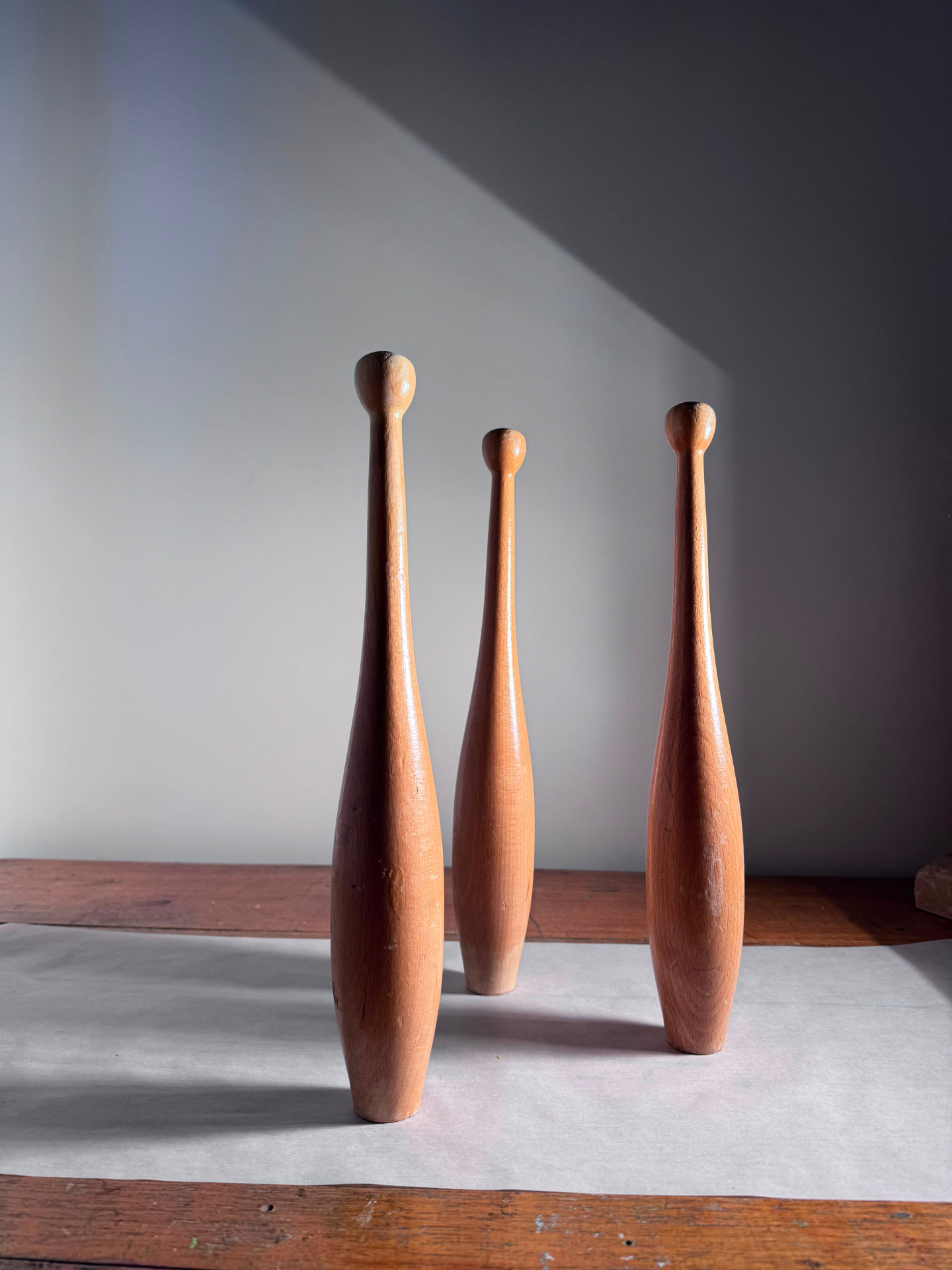
Where is it coming from? Where is the lightest area, and the darkest?
Follow one form from light into shadow. What happens as it turns away?
Now look at the shadows. What do they tell you?
Tone + value
Tone describes how light or dark something appears. You may also see this called value.
Different parts of a three dimensional form receive different amounts of light. Those differences are what let you describe a form on a flat surface in an image.
LIGHT → FORM → SHADOW
Try
Find the range
Find out what your material can do before you draw an object.
01 / Continuous tone
A gradual movement between light and dark rather than separate bands.
Draw a long rectangle. Start at the darkest tone your pencil can make and ease the pressure off until the other end is almost white. Keep the change continuous.
Try pressure, layering, the side of the graphite, and the direction of your marks. See how much range you can find before you reach for smudging.
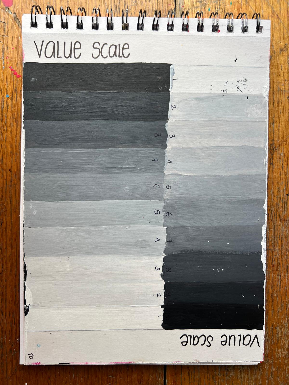
02 / Tonal scale
A tonal or value scale separates light to dark into steps. Make your own in graphite, charcoal or paint. Start with your lightest light and darkest dark, then work out the tones between.
Can you make each neighbouring tone visibly different?
Continuous tone. Studio diagram.
Materials
Material encounter
Find out what each material actually does.
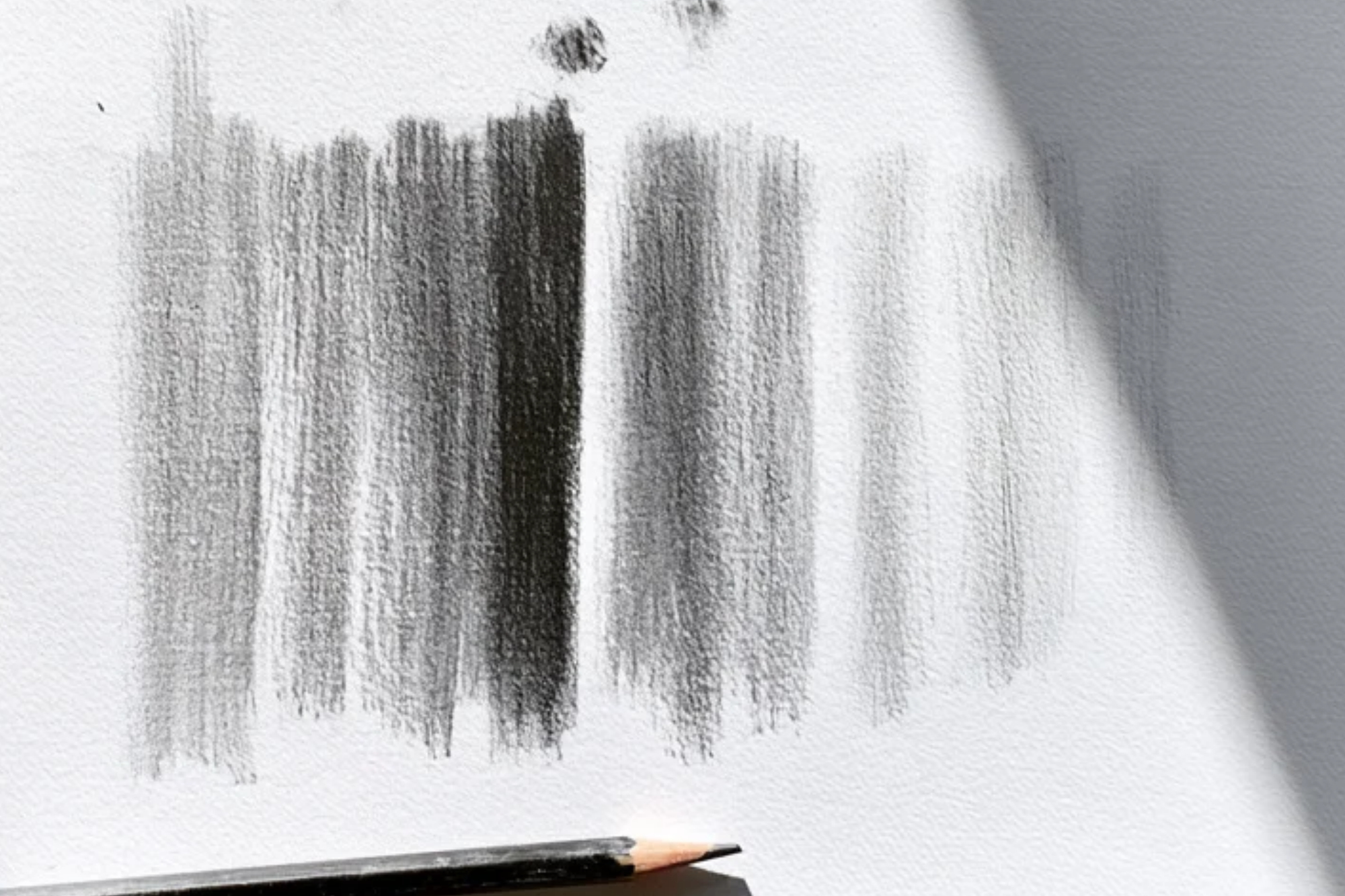
Pressure and layering change the tone. Try the point and the side of the pencil.
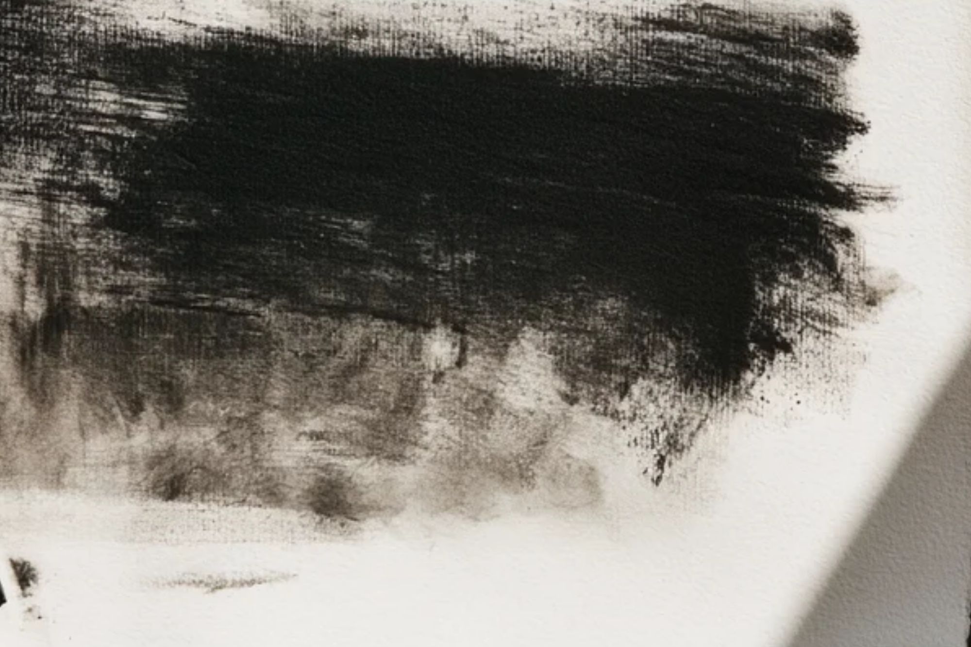
Build dark tones quickly, then try softer marks and edges.
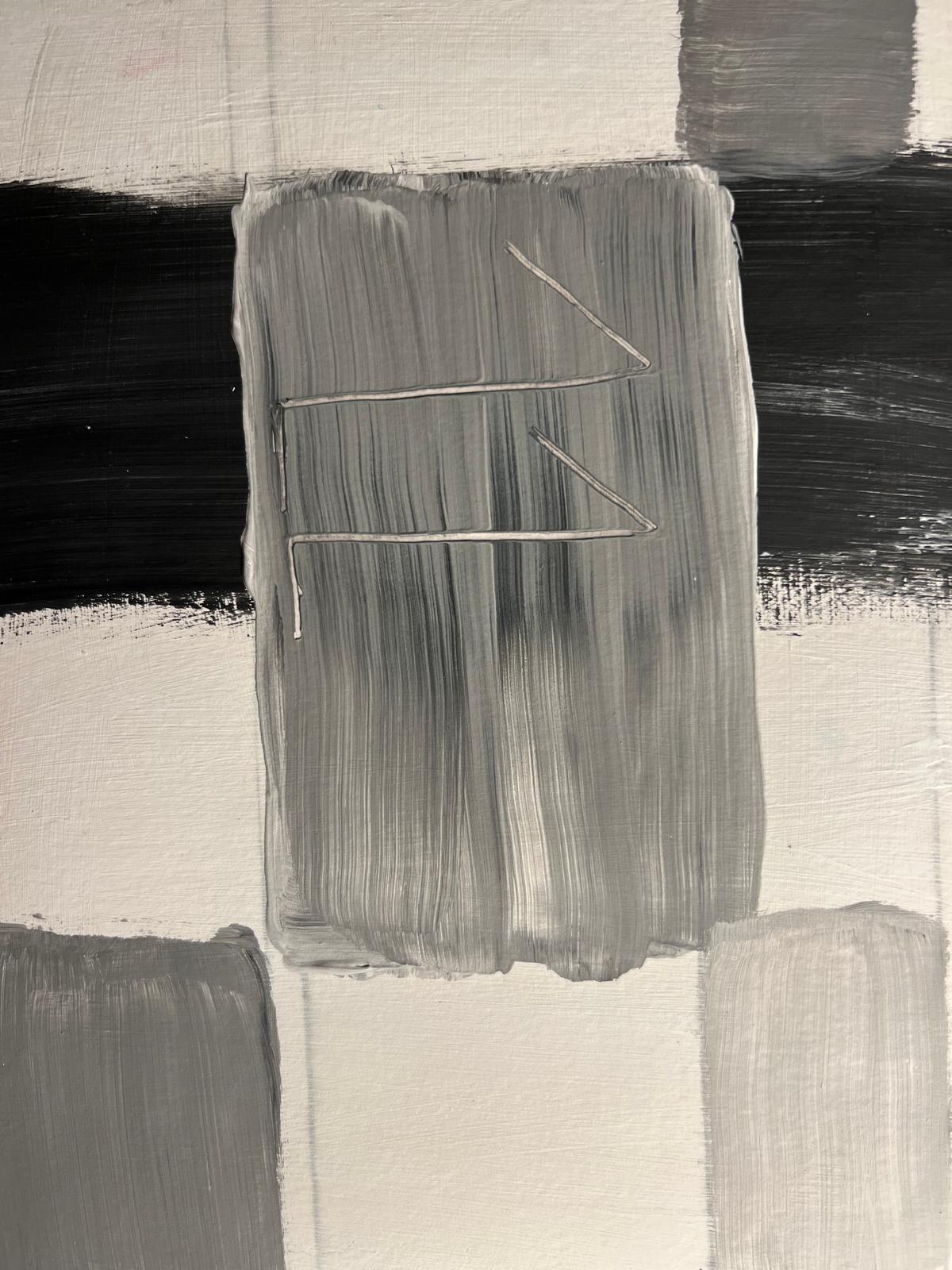
Notice what changes when you mix, layer or change the direction of the brush.
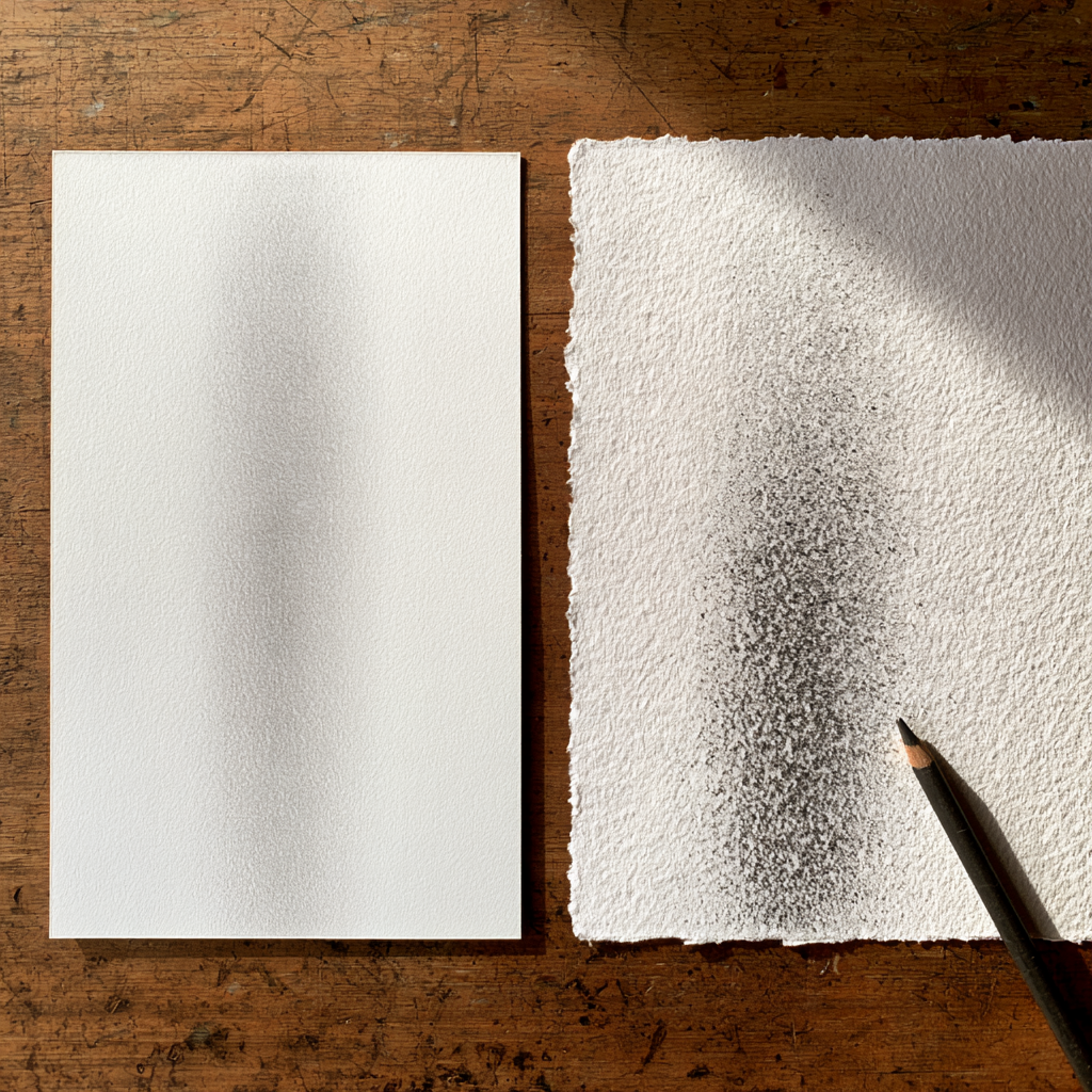
Compare how the same mark behaves on smoother and rougher paper.
Repeat a small tonal study with another material. What becomes easier? What becomes harder? What happens to the surface?
Understand
How light moves across form
A sphere makes the pattern easy to see. The highlight sits where the light is strongest; as the surface turns away, the tone moves through the midtones into darker shadow.
Light bouncing off nearby surfaces can return into the shadow side as reflected light. When the object blocks light from reaching another surface, it creates a cast shadow.
One sphere, one directional light source. Studio diagram.
THE SPHERE IS A MODEL, NOW LOOK AT THE REAL THING.
Make
Choose the amount of support you need today.
- 01 / Set up
Choose one simple object and place it near one directional light.
- 02 / Find
Locate the direction of light, lightest light, darkest dark and cast shadow.
- 03 / Begin
Establish the overall shape and proportion.
- 04 / Build
Keep the highlight open and gradually build the midtones.
- 05 / Deepen
Develop the darker tones and the cast shadow.
- 06 / Look again
Look for reflected light and compare the drawing with the object.
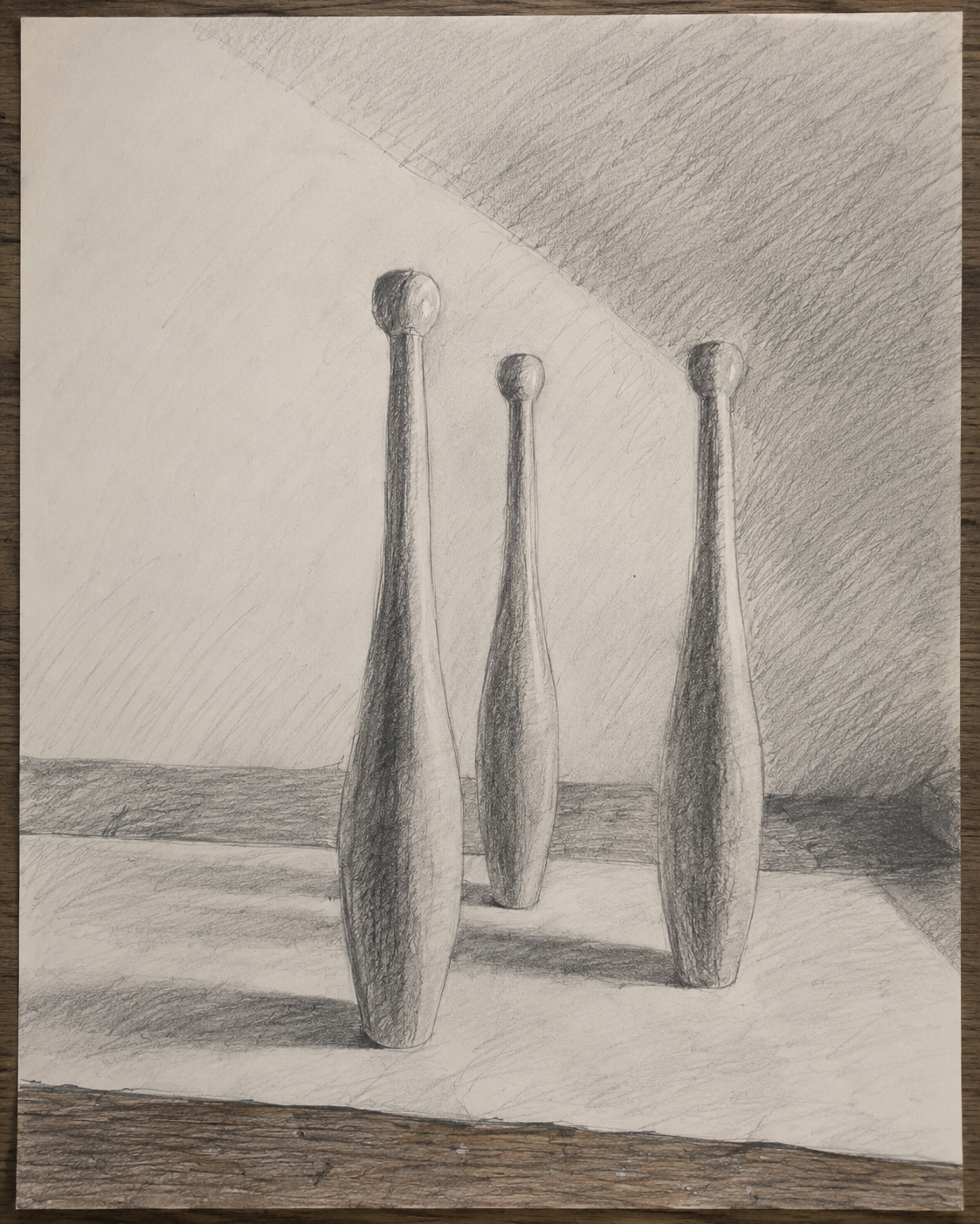
WATCH
Look again
MAKE → LOOK → ADJUST
Where is the strongest contrast?
Which tone was hardest to judge?
Where does an edge become difficult to see?
Move the light source. What changes?
In practice
Light changes what we notice
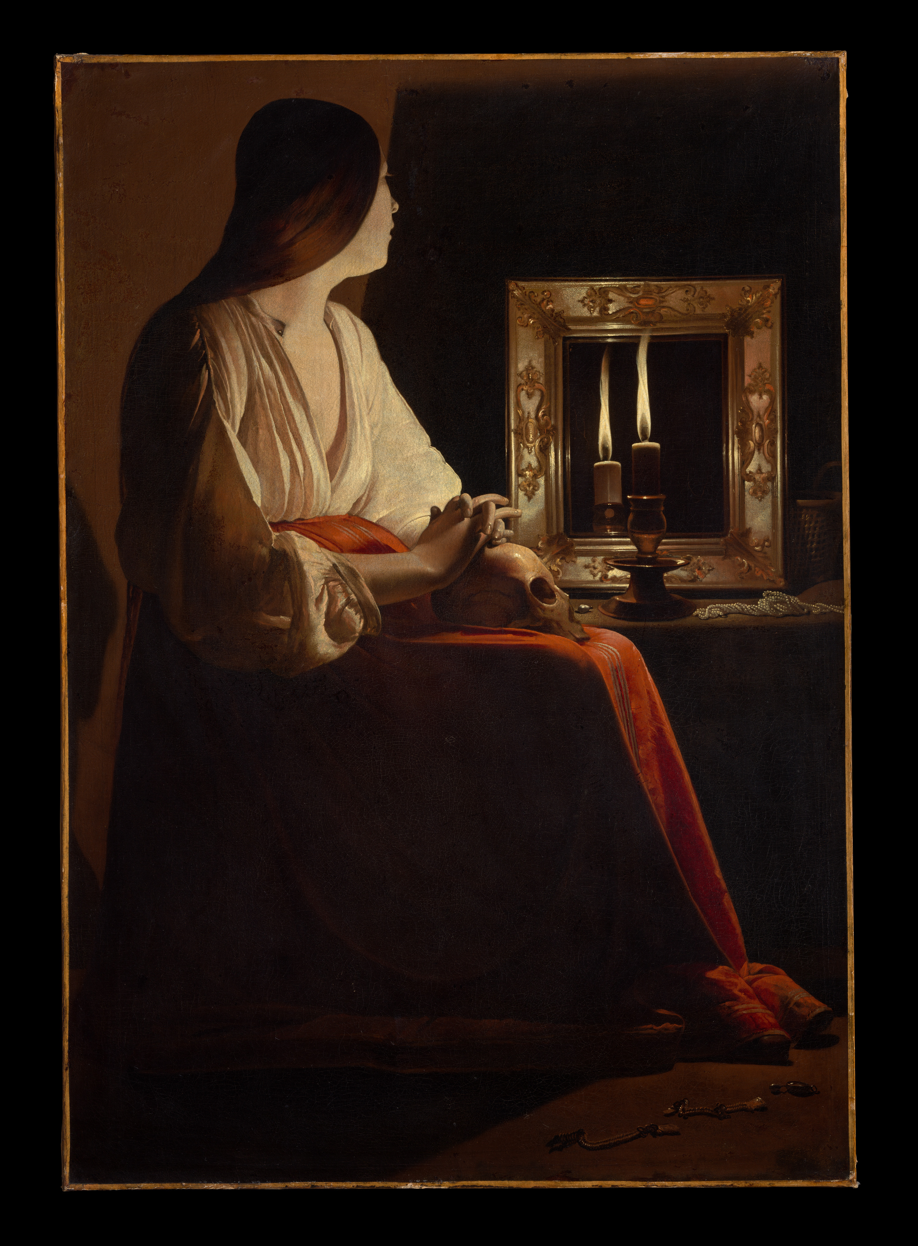
Look first.
Where is the light coming from?
Where is the strongest contrast between light and dark?
Which parts of the figure can you see clearly? Which disappear into shadow?
Where does your eye go first? Why?
What could you make visible or hide by changing the light in your own setup?
The strong contrast between candlelight and shadow contributes to the quiet, contemplative mood of the painting.
In your practice
Use light and tone to explore form, atmosphere, attention and meaning. Change the light, material or tonal relationship and notice how this changes the way you respond to the subject.
Artists can use light, tone and material qualities when developing and resolving artworks.
Use tone to communicate three dimensional form, surface, material and lighting. In development and presentation drawings, rendering can help another person understand the object or space you are designing.
Learning to see tone begins with comparing what you expect to see with what the light is actually doing.
Creative thinking
Where does the strongest contrast pull your attention?
What changed when you moved the light?
Keep one trace of the experiment. Draw, photograph, label, note, arrow, circle or question.
Tools to help you notice, describe, question, develop and document your work.
Curriculum + reading
Bowden, M., & Tooke, A. (2022). Art making and exhibiting: VCE units 1–4. Cambridge University Press & Assessment.
Greenwood, D. (2023). Art creative practice: VCE units 1–4. Cambridge University Press & Assessment.
Guthrie, K. (2017). Nelson visual communication design: VCE units 1–4 (4th ed.). Cengage Learning Australia.
Victorian Curriculum and Assessment Authority. (2022). VCE Art Creative Practice study design 2023–2027. vcaa.vic.edu.au ↗
Victorian Curriculum and Assessment Authority. (2022). VCE Art Making and Exhibiting study design 2023–2027. vcaa.vic.edu.au ↗
Victorian Curriculum and Assessment Authority. (2023). VCE Visual Communication Design study design 2024–2028. vcaa.vic.edu.au ↗
Artists + artworks
La Tour, G. de. (ca. 1640). The Penitent Magdalen [Oil on canvas]. The Metropolitan Museum of Art, New York, NY, United States. Object no. 1978.517. Public domain. metmuseum.org ↗
Studio material
Directional Light Study.
Tonal Scale.
Graphite Study.
Material Experiments.
Sphere and Continuous Tone Diagrams.
Visual material: Studio work, 2026.