08 / The Studio
COLOUR
Colour changes in relationship.
A colour can seem brighter beside one colour and quieter beside another. Learning colour begins with mixing, comparing and noticing what happens.
TODAY’S FOCUS
Mix colours, place them together and notice what changes.
Look
START WITH THE COLOUR WHEEL
The colour wheel is a way to see relationships between colours.
This block uses a traditional red, yellow and blue paint colour wheel.
TWELVE HUE PAINT COLOUR WHEEL Studio diagram.
Materials
Material encounter
MIX + COMPARE
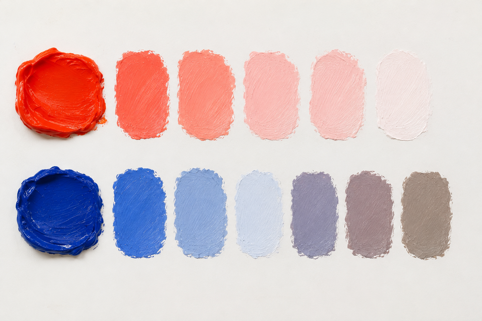
Mix first. Name it afterwards.
Choose one colour. Put some on your palette.
Mix a little white into it. Make another mixture.
Now mix a small amount of its complementary colour into another sample.
Keep the mixtures beside each other. Look at them together.
WHAT CHANGED?
Understand
COLOUR HAS MORE THAN A NAME
HUE / VALUE / SATURATION / INTENSITY Studio diagram.
WATCH
Try
PUT COLOURS TOGETHER
Analogous
Colours sitting beside each other on the colour wheel.
Blue · Blue green · Green — or Red · Red orange · Orange.
Because these colours are closely related, they can create a sense of harmony.
ANALOGOUS COLOUR Studio diagram.
COMPLEMENTARY COLOUR Studio diagram.
Complementary
Colours opposite each other on the colour wheel.
Blue + Orange. Red + Green. Yellow + Violet.
Placed beside each other, complementary colours can create strong contrast. Mixed together, they become less saturated and more neutral.
Choose one colour relationship. Make three small studies.
You might use:
- three neighbouring colours
- one complementary pair
- one hue with changing value
- one warm and cool combination
Keep the studies small. Compare them beside each other.
What changes when the colours sit together?
Look again
WARM + COOL
WARM + COOL Studio diagram.
When warm and cool colours are placed together, some can appear to come forward while others appear to recede.
Where does your eye go first?
What changes when the colours swap places?
Understand
OBSERVED + CHOSEN COLOUR
Colour can describe what we see.
Artists can also choose colour for other reasons.
OBSERVE COLOUR CAREFULLY.
THEN CHOOSE TO CHANGE IT.
Look
PAUL KLEE
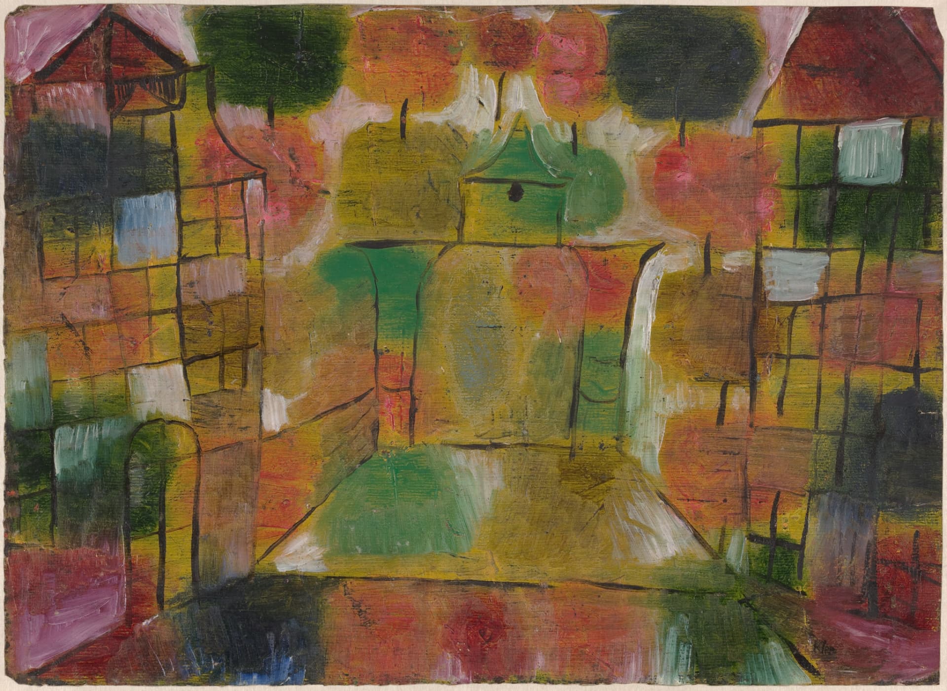
LOOK CLOSELY
Where does your eye go first?
Notice how Klee places different colours beside one another.
What happens where a bright colour meets a darker or quieter one?
Look at the black lines and geometric shapes.
How are colour and structure working together?
Make
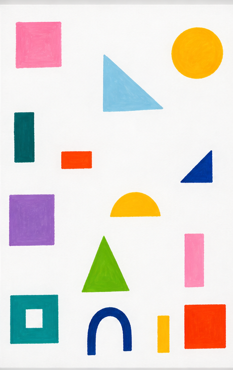
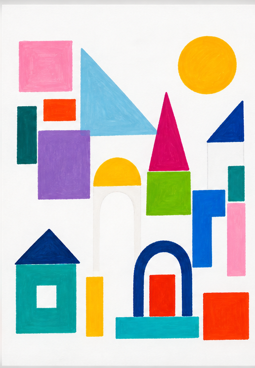
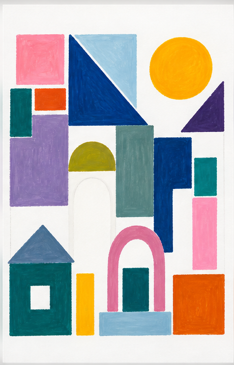
BUILD WITH COLOUR
Begin with a loose arrangement of geometric or architectural shapes.
These might grow from:
- rectangles
- circles
- triangles
- windows
- roofs
- blocks
- lines
Then choose one colour relationship to explore:
- analogous
- complementary
- one hue with changing value and saturation / intensity
- warm + cool
Paint, gouache, coloured pencil or another colour medium. Some paper can remain visible.
Look again
PAUSE + LOOK
Put the work down for a moment. Look from a little further away.
Where does your eye travel?
Is one colour taking over?
Are there areas that could become quieter?
Would changing the value of one colour shift the balance?
Try one small change and look again.
In practice
Artists mix, test and change colour to develop visual language and communicate ideas, feelings and meaning.
Colour works with materials, techniques and other art elements to affect how an artwork is experienced.
Designers use colour with contrast and hierarchy to direct attention, organise information and communicate.
SCREEN + PRINT
The same colour can look different on screen and in print.
Document
KEEP WHAT YOU DISCOVER
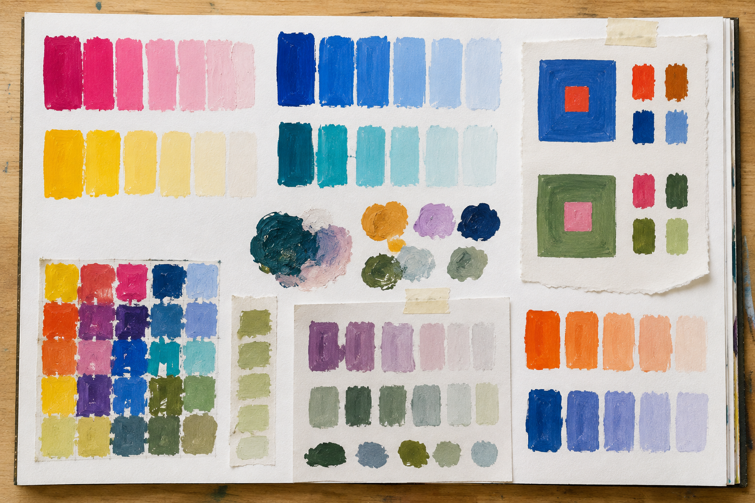
Keep your colour mixtures, tests and small studies in your visual diary.
Beside something that surprised you, record what happened.
Keep a colour combination you may want to return to later.
Creative thinking
What changed when two colours were placed together?
Which colour relationship changed your work most?
Keep one mixture or colour test you may want to return to.
Tools to help you notice, describe, question, develop and document your work.
Curriculum + reading
Bowden, M., & Tooke, A. (2022). Art making and exhibiting: VCE units 1–4. Cambridge University Press & Assessment.
Greenwood, D. (2023). Art creative practice: VCE units 1–4. Cambridge University Press & Assessment.
Guthrie, K. (2017). Nelson visual communication design: VCE units 1–4 (4th ed.). Cengage Learning Australia.
Hornung, D. (2012). Color: A workshop for artists and designers (2nd ed.). Laurence King Publishing.
Victorian Curriculum and Assessment Authority. (2022). VCE Art Creative Practice study design 2023–2027. vcaa.vic.edu.au ↗
Victorian Curriculum and Assessment Authority. (2022). VCE Art Making and Exhibiting study design 2023–2027. vcaa.vic.edu.au ↗
Victorian Curriculum and Assessment Authority. (2023). VCE Visual Communication Design study design 2024–2028. vcaa.vic.edu.au ↗
Artists + artworks
Klee, P. (1920). Baum und Architektur—Rhythmen (Tree and architecture—rhythms) [Oil on paper]. National Gallery of Art, Washington, DC, United States. Gift of Benjamin and Lillian Hertzberg. Public domain. nga.gov ↗
Studio material
Twelve Hue Paint Colour Wheel.
Hue / Value / Saturation / Intensity.
Mix + Compare.
Analogous Colour.
Complementary Colour.
Warm + Cool.
Build with Colour.
Colour Tests.
Visual material: Studio work, 2026.